|
If you're feeling generous and would like to support the Mayo Art Program, you can find our Amazon Wish List by clicking the link below. Every little bit helps! A hear-felt thanks in advance. 
0 Comments
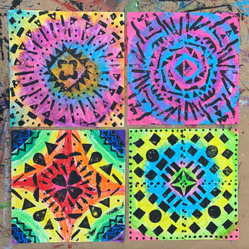
Throughout our journey of learning the Elements of Art, students have practiced different art styles and techniques. For this element and for the introduction of positive & negative space, students created projects with construction paper. The colored paper signifies the positive space while the black paper signifies the negative. These were created just in time for Fall, so they are proudly displayed in the upstairs hallway! 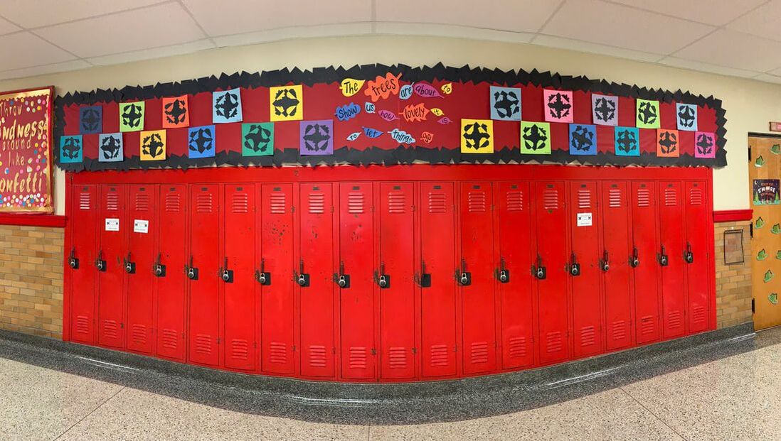 Next, students practiced the concept of positive/negative space while being introduced to a new art style: printmaking. Students first created their colorful background by applying oil pastel to a 12" square paper. Next, they created their printing plate by cutting and pasting foam shapes to a 6x6" piece of cardboard. The students then rolled black acrylic paint onto their plate with an ink brayer and stamped their plate four times in a clockwise format, providing their project with radial symmetry. They absolutely loved this project!
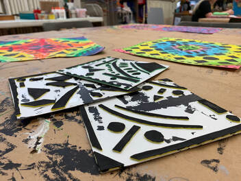
Lastly, students learned another type of printmaking (relief printing) that involves carving into a surface. When that surface is inked, the ink goes onto the raised part of the plate, leaving the carved areas without ink. For the project, students chose a logo from a candy/food/drink of their choice. We used laptops to zoom in on the image and crop it artistically ("drawing big" is another way to show space). The students carved their logo out of a linoleum plate and used ink to print it four times on colored paper that corresponds to their chosen logo. Students were eager to use real printing ink and the small rolling press in the art room. 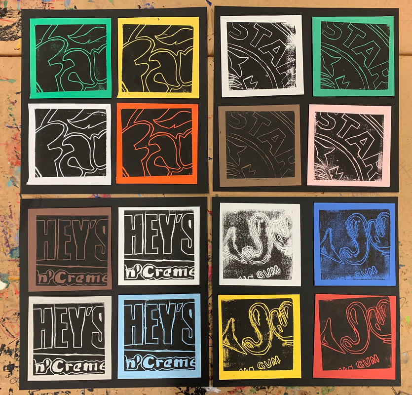 Student Samples
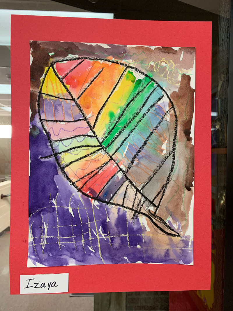
top row, left to right: Isabella Sohaski, Haylee Bryan bottom row, left to right: Madison Loveless, Carrie Watson Mr. Lowry's class created a collaborative project inspired by Peter H. Reynolds' book, The Dot. The story follows a young student (Vashti) who feels discouraged in art class. "I just can't draw!" she tells her art teacher, who responds by telling her to "make a mark and see what happens." Vashti makes a dot on her paper and gives it to her art teacher, who frames it in gold and hangs it above her desk. This inspires Vashti to create more dots - big, small, multi-colored, etc. By the end of the story, Vashti has enough dot paintings to have her very own art exhibit. The story is inspiring to young students who feel discouraged about their own abilities. After reading the story, the class made a series of dots - different colors, different mediums, even different shapes (some were leaves). The dots were arranged on the top of a tree to appear as leaves. It was amazing to see the collaboration between the kids and the masterpiece they created together. 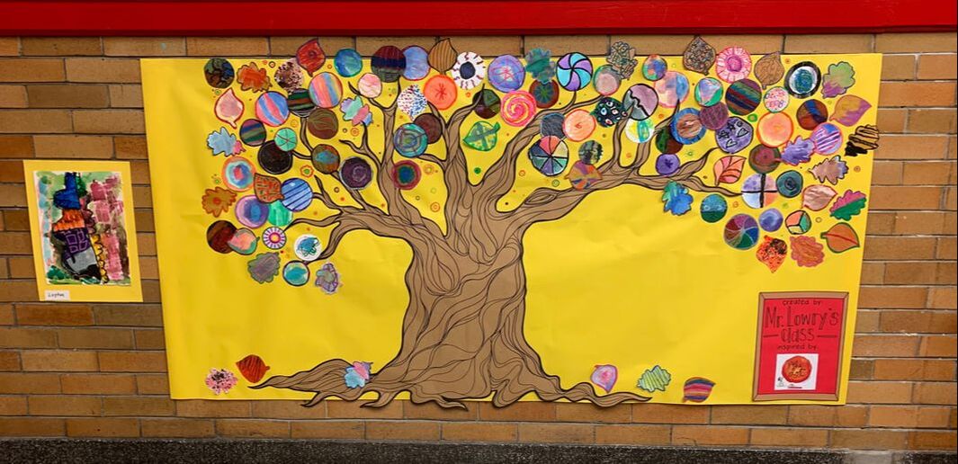 The Dot Tree is displayed in the downstairs hallway.
The third Element students practiced was Value. First, students learned how to shade objects according to a light source. For this project, they created 3-dimensional forms by cutting the shapes out of construction paper and using charcoal to add values. They filled then glued the shapes to a newspaper collage background and gave each shape a cast shadow according to it's light source. 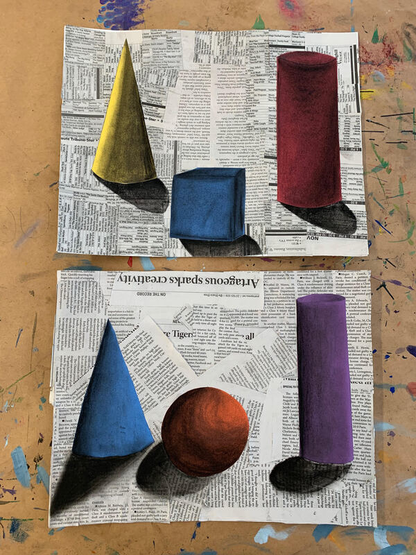 Student samples top to bottom: Carrie Watson and Macee Shoeing Next, students practiced value in a different form by revisiting our monochromatic color scheme. Students created a layered image of trees descending into the distance. The trees furthest away were not only smaller, but also lighter in color. The middle ground trees were a mid tone, and the trees in the foreground were the darkest. The students drew and cut out their foreground trees to place on top of their paintings. Their skies were also a value scale, as they were dark towards the top and grew lighter as they approached the horizon. 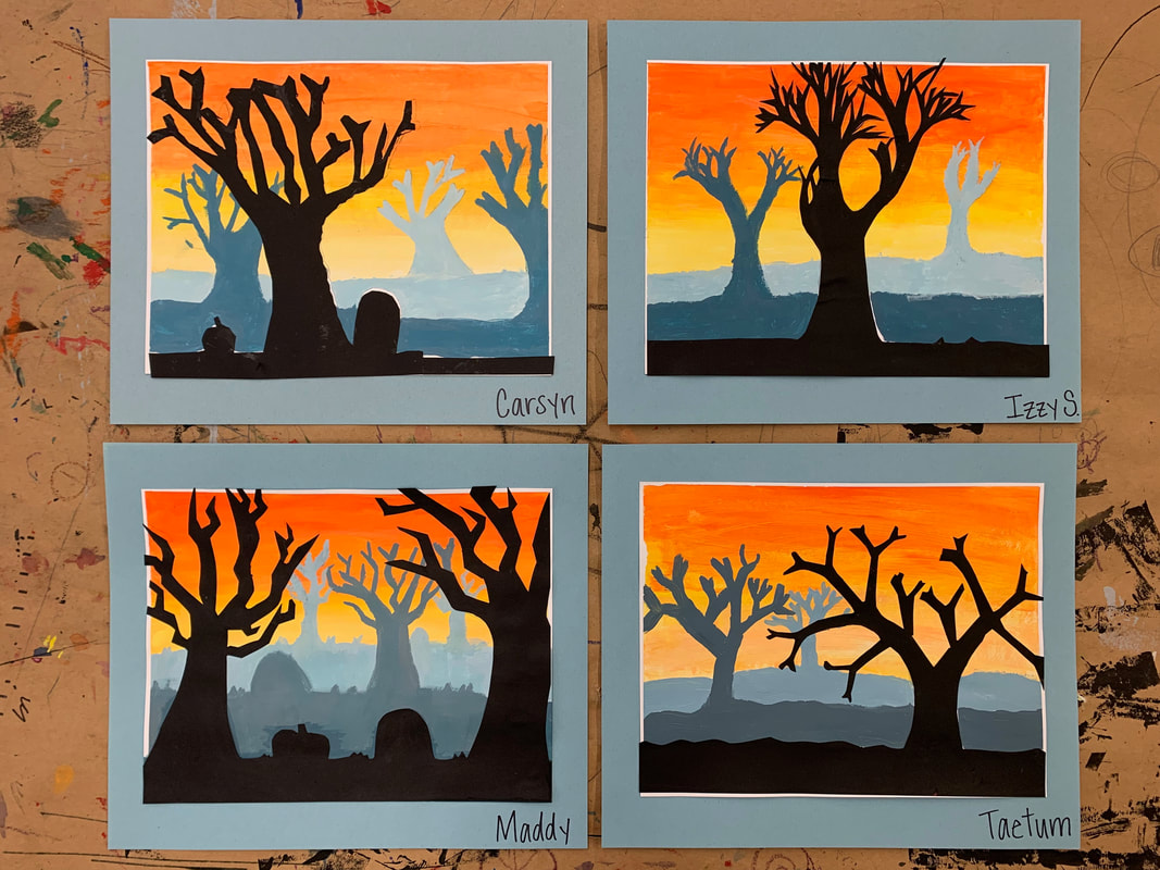 |
AuthorMrs. Millie Arp Hamilton Archives
May 2023
Categories |
 RSS Feed
